

Showing posts with label book. Show all posts
Showing posts with label book. Show all posts
Wednesday, 24 July 2019
Gallery Post - A Public Domain Project

Tuesday, 11 September 2018
Vicious Vignettes - Some Covers For A Friend
A VERY GOOD FRIEND OF MINE has just finished a second collection of flash fiction and needed a cover to match the first, which was done by someone else on Fiverr. I suggested a fresh start with matching designs for both. I tried to keep it simple but fragmented the text panel to suggest the nature of the content.


I have designed full covers for print editions but will post those once they are finalised.
As always, click the images to see a larger size.
Wednesday, 25 July 2018
Gallery Post - Fragments of an Idea

CLICK ON THE IMAGE to see at a larger size. This is based on a couple of covers from, I believe, the sixties. I'll talk about them more in another post focusing on different cover designs. I built this on into a full template for future projects.

Tuesday, 24 July 2018
Gallery Post - Gold is the Coldest Color

CLICK ON THE IMAGE to see at a larger size. This was another experiment in colour. The title uses a free font, called Merienda Bold, which I think works well for this project. The tag is in Ascelon, while the author is in Lydian.
Gallery Post - Blood Flows in Shades of Red

CLICK ON THE IMAGE to see at a larger size. This one was a bit of an experiment in shades of red. The title font is Nightmare, which you can get from The Scriptorium and was based on an old book font. The tag text is in Ascelon, again from The Scriptorium, while the author's name is in Lydian.
Saturday, 21 July 2018
Gallery Post - A Night Not For Sleeping

CLICK THE IMAGE TO SEE at a larger size. The title font is Area of Suspicion and the tag text is Ascelon, both from The Scriptorium, The author's name is in Lydian.
Wednesday, 18 July 2018
Cover Tutorial - Underwater
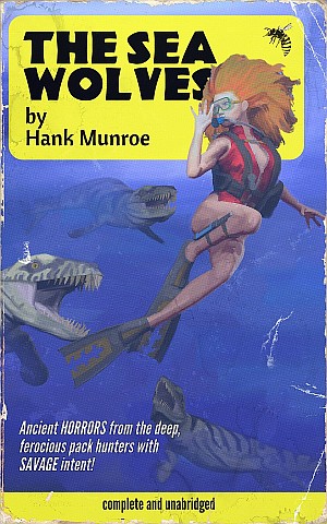
UNDERWATER IMAGES NEED a couple of additional tricks to pull off. I'm going to assume that you've looked at building templates and the First Cover tutorial already and will dive right into this one. 'Deep Sea Thrillers' seem to be very popular these days, if only with the writers, so if you're going to supply for the modern pulp market, this is a genre you should work with.
If you are using 3D staging software like Poser, then fortunately, there are a lot of underwater monsters available to buy a very reasonable prices. You can find fantasy monsters, a giant octopus, creatures direct from Lovecraft's imagination, along with a large assortment of sharks, dolphins, and whales. Even a few fish. Best of all, there are lots of prehistoric beasts, most by a chap who sells under the name of Dinoraul. I shall do some posts featuring his work at some point but really, if you mean to do pulp at all, burn that name into your brain - great prehistoric models, and great fantasy beasts. The creatures in this image are his.
Cover Tutorial - First Cover

FOR OUR FIRST COVER, I think we should keep it very simple. We're going to have a single figure and prop - and that's it. I'm going to assume that you have some working knowledge of the software used, though I'm not going to talk about any very sophisticated functions. I'm also going to assume that you've created the paperback templates as described in my previous post. The programs I'll be using are Poser, Affinity Photo, and Artrage.
For Poser, you could just as easily use DAZ Studio or Carrara. For Affinity, you could use Photoshop, Elements, or GIMP. For Artrage... well, you can use Painter.
Before continuing, I think it worth saying something about why I use a program like Poser to create my source images, rather than using photographic.
Sunday, 15 July 2018
The Scriptorium / Fontcraft
 THE SCRIPTORIUM IS A FONT FOUNDRY that specializes in reproducing antique and hand drawn fonts. There are so many fonts that you’ll want to put on a book here that you could spend your savings within 10 minutes. So, stay focused and subscribe to their newsletter as they do have occasional sales.
The most cost effective way to shop with them is to buy packages of fonts - I’ve picked up a few of these since starting this project and haven’t regretted any of them.
Pulp Fonts Package
A good place to get started is their Pulp Fonts package, which was my first purchase, and most of which was designed from pulp book cover type. Containing eight fonts, there’s a little of everything.
Free Commercial Use Fonts

IT'S EASY TO THINK that you can’t have enough fonts. This might even be true. Now, pretend that it isn’t. Keep focused on the needs of your project and try to source only fonts that are going to be useful for the covers you are making. Otherwise, you are going to spend all your time amassing a huge collection that you’ll have to sift through every time you want to find something - you’ll also spend a fortune on stuff you may not need.
The next bit of advice is specific to free fonts. Download only what is licensed for you to use commercially, then try out what you do download and if you don’t think you’ll use it or if the quality is not what you had hoped for, then uninstall and delete it.
In this post, I’m going to focus on free fonts that could be of use to you, along with links to where you can get them.
First up is a selection from Fontspring - you will need to sign up to get them but they haven’t been spamming me, so I can recommend them.
Saturday, 14 July 2018
Getting Started with Covers
 FOR MOST OF US, when we think of pulp literature, we think of two things: the covers and the content.
Before we can talk about either, we need to clarify a little what it is that we are talking about. Pulp was a term first applied to the pulp magazines of the early twentieth century, whose covers, on a broader canvas than the paperback, were colourful, lurid, and sensational. These are not my main target here. Instead, I’m interested in their spiritual successor: the cheap pocket paperback. A smaller, narrower canvas created different demands from artists, but because they were selling a single novel (usually) rather than a collection of stories, the on-cover text could be limited and focused.
Like many readers my age and older, I was attracted to the painted paperback of old, they were covers, with their unique aesthetic, full of promises to reader - and that is what sells books. I find many of today’s ePulp covers lacking something, though, in fairness, it is through no fault of their own.
The market for this sort of fiction today is very different from that of the past. Back then, sales would support the cost of professional cover artists, while today’s pulp publishers are working with micro-budgets. To meet the demand for budget covers, there is now a cottage industry in what are being termed ‘pre-made’ covers (or which professionals apparently prefer to term ‘ready for print’). These covers are largely created using stock photos manipulated in a photo editor, such as Photoshop, and feature fairly generic designs so as to maximize the number of books they might be suitable for. It is a scatter-shot strategy, as the designer cannot count on a return from every product, they must keep production costs and time to a minimum, so as to maximize their production output while keeping the price low enough for the customer base. This is why there is such reliance on cheap stock photos and generic designs intended to have a broad appeal, a formula that results in a marketplace of some very competent but frequently either bland and/or samey images.
Subscribe to:
Posts (Atom)